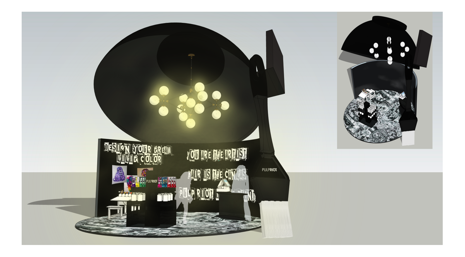
For this project, I created shop-in-shop from scratch in Sketchup and then refined the design from an angle in Photoshop. I thought back to the kind of pop-ups that would intrigue me in a tradeshow or airport environment. The thought process brought me back to the annual hair show that is hosted in Columbus every year. I thought about which spaces popped out to us as students, which brands brought us in and kept us engaged, and what stands we actually made purchases from. I chose to do a vivid hair color brand called Pulp Riot. I remembered what drew me to the occupation in the first place- the freedom of creativity. I used my past experience working as a hairstylist as my main inspiration for the design. Pulp Riot has a lot of tattoo-like imagery in its branding. I utilized their style on their packaging to ensure that the space was a clear reflection of the brand. Pulp Riot’s spirit is all about creativity and artistry, so I thought it would be very on-brand of them to have an activity where customers can come in and play with the hair colors themselves. I create spaces where people can fully immerse themselves in the brand. When customers can do this they spend more time in the space and are given an opportunity to establish a relationship with the brand.
